#Makeitmonday: Articles
9 February 2015
By the time you get to the top year group, you’ve probably been on lots of amazing school trips, won competitions and held more than a few events! Besides adding collages, you can document these moments by making beautifully designed article pages to tell your stories and relive those memories  This week #Makeitmonday is all about Articles and how to create interesting and stylised pages!
DESIGN 1: PICTURE THIS
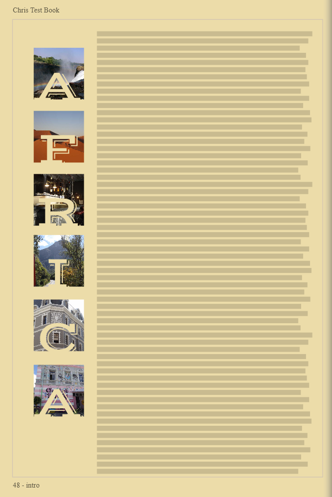
Sometimes there will be a trip so momentous that you need a lot of text to really sum up what you experienced and learnt on your travels. This design is very straight forward but a clever use of titles really brings the page to life!
To create a page like this, first decide on the background colour for your page. You’ll need to apply a flat colour for this one to work so go for a suitable colour that reflects your trip. For an African safari, choose a khaki colour or for a ski trip choose a frosty blue or white, you get the idea! Now add a text box to the page by clicking add text box then add your first photo frame. You’ll need to play around with the sizing of your photos to ensure they’re equally spaced and most importantly, all of your title letters fit! When you’re happy, duplicate the frame accordingly and drop your photos into place. Add each letter of your title by clicking the add title button and drag this over each of your photo frames. This example uses font VAST in 66pt 
DESIGN 2: GATSBY GLAMOUR
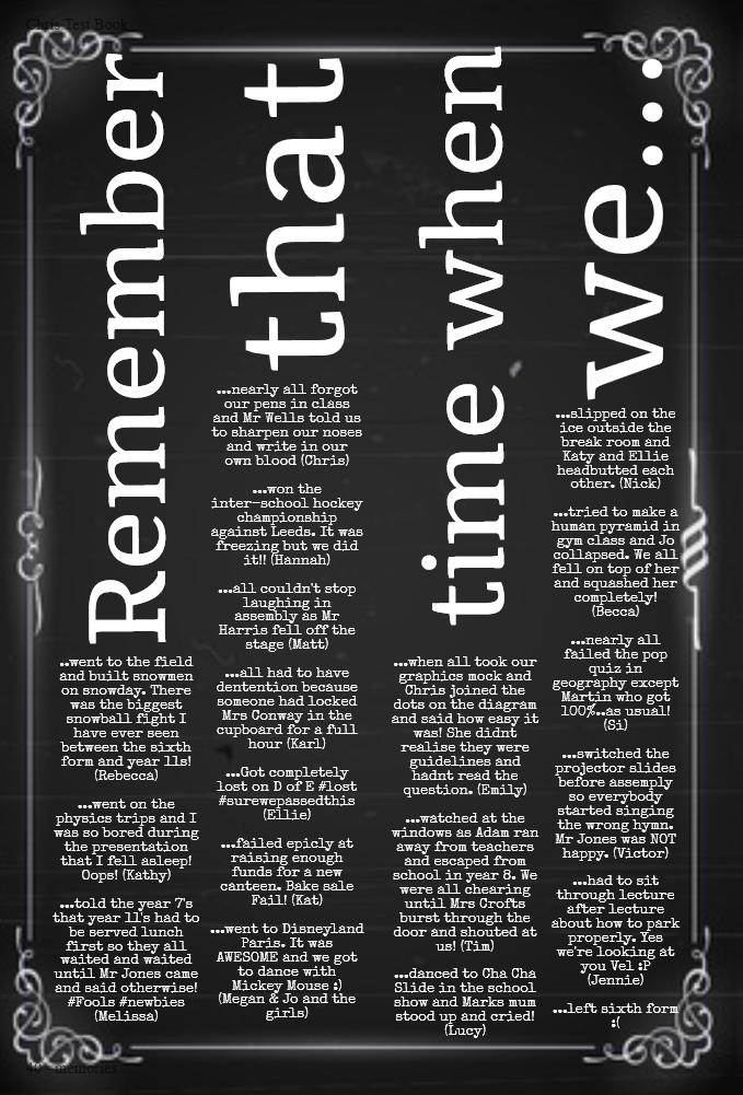
I really love the presentation of this page. It takes a very text heavy page and fragments it into little bitesize pieces which are much easier to read  This is a perfect design for those of you going down the Gatsby route so lets have a look at how it was made…
Usually the page title is a small detail but this is really the focal point of the page here with this vertical alignment. To get started with this design, use the add title feature and boost your font size right up! Rotate your title text so it runs vertically on the page and repeat as needs be for each part of the title. Now you want to add a text box under each word of your title to create this columned effect. Select the Noir background by clicking on the theme icon on the toolbar of your page designer and then onto backgrounds. You’ll find this option (and many other backgrounds) here which you can apply to your pages 
DESIGN 3: CREATIVE COPY
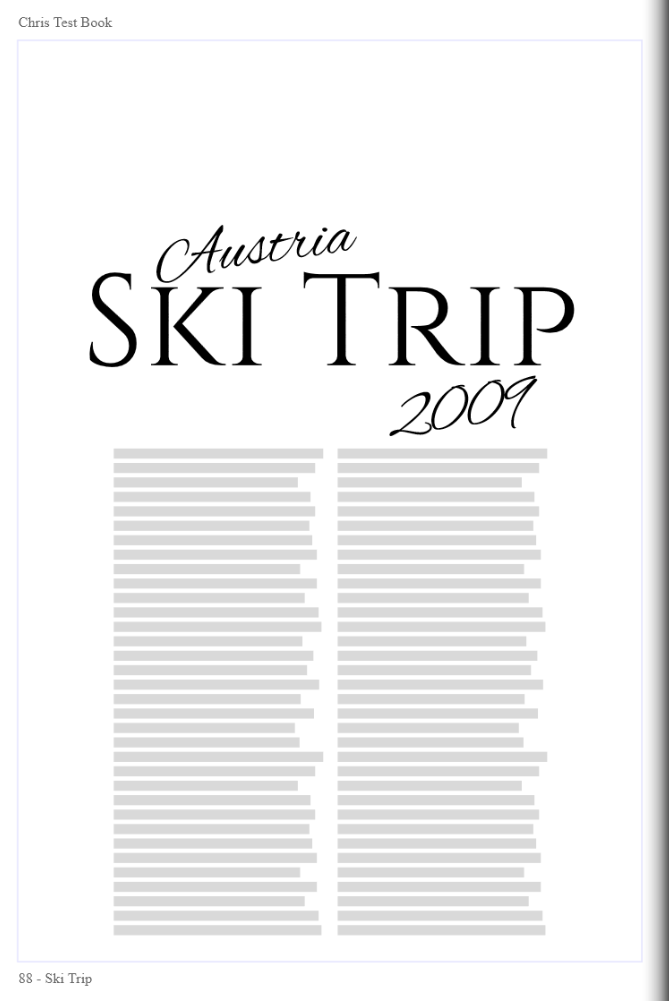
I know it’s tempting to throw lots of content on a page and try and squeeze in every photo of your yeargroup ever but on occasions, less is definitely more. This article has been put together very simply and has a real magazine feel to it thanks to the simple monchrome palette used. 
The design of this page will take you literally 30 seconds to put together.I’ve selected two of the standard font options Alex Brush and Cinzel to create the title and split the body of the article into columns by clicking onto your text box, and adjusting the columns setting in the options box for a more of an editorial look.
