#Makeitmonday: Contents Pages
The first page is important to setting the tone of your yearbook and often a contents page is a great way to introduce a certain style or design idea. You want a book to grab your attention from the onset and often a contents page can be a bit of an after thought. To change this way of thinking, we wanted to introduce a selection of lovely designs to help inspire you 
DESIGN 1: BRIGHT AND BEAUTIFUL
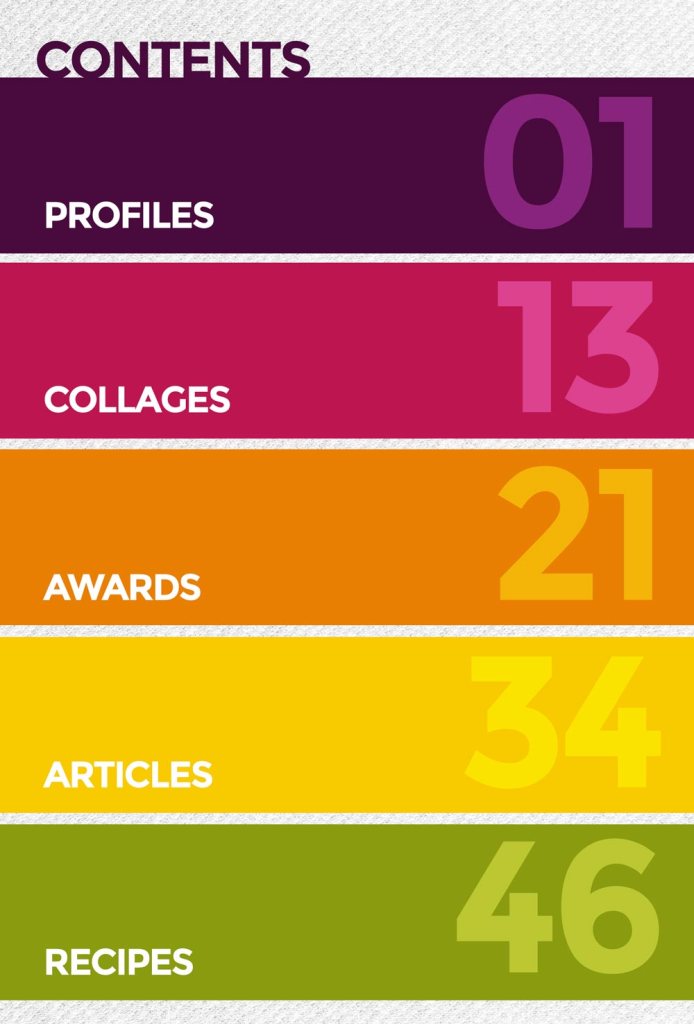
Take this bold and colourful band design, it’s playful and vibrant but in a clever way. Throwing colour onto a page doesnt always work but by introducing a tonal palette you can create contrast in a sophisticated way.
To replicate this design, you’ll first need to add a fill shape to the page. Drag this out across the full width of your page and adjust the height accordingly. Got lots of sections to include? Opt for skinny colour bands instead of these chunky ones  Once you’ve created your first fill shape, duplicate it using CTRL + D, this will ensure the boxes are all exactly the same size. Now you’ll want to apply your colours to each of the bands- You can do this easily in the shape options box.
The next step is to add your text. Use the add title button to do this and drag the titles onto each of your fill shapes. Now add a second set of ‘titles’ but just include the page number that section starts on. To really make an impact, ramp up the font size to 98pts and apply your colours!
DESIGN 2: MEGRIM MAGIC
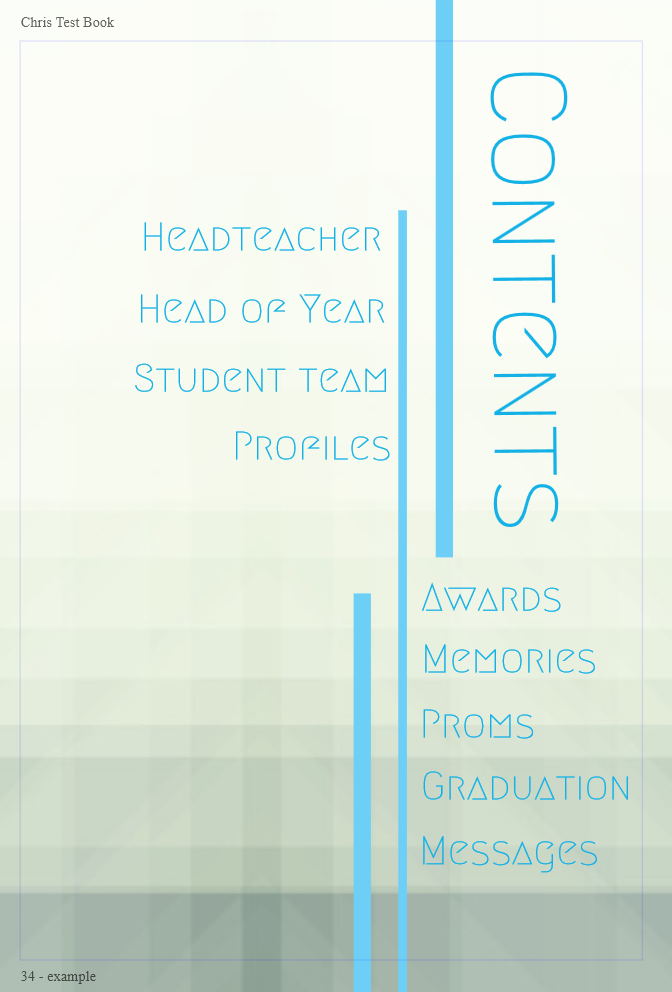
As you all know, the font options you have this year are incredible. 600+ fonts and this Megrim font has got to be one of my favourites. Add it to your font palette by jumping to page 38 of the options in the font selector. It instantly has a strong and modern design that’s been enhanced with a few simple tricks.
Once you’ve added this font to your palette, open your page and use the add shape button to create these very skinny fill shapes across the page. By making some of bands slightly wider, you trick your eye to seeing certain things first. The bold line on the right is the first to stand out as you’ll instinctively read across and then down the page. This brings you to the page title and the vertical arrangement of this draws your eye down the page too.
Now use add title button to add in each of your section titles. The alignment here is ever so slightly of centre but you’ll be filling the space with a great background. This one is called abstract and you can find this in the background selector!
This design is more about introducing the subjects in the book and doesn’t feature page numbers as a standard contents page would. If you really want to add these in though just add a few more title text boxes and reduce the font size down before aligning them under the section titles.
DESIGN 3: THE JAUNTY JOURNAL
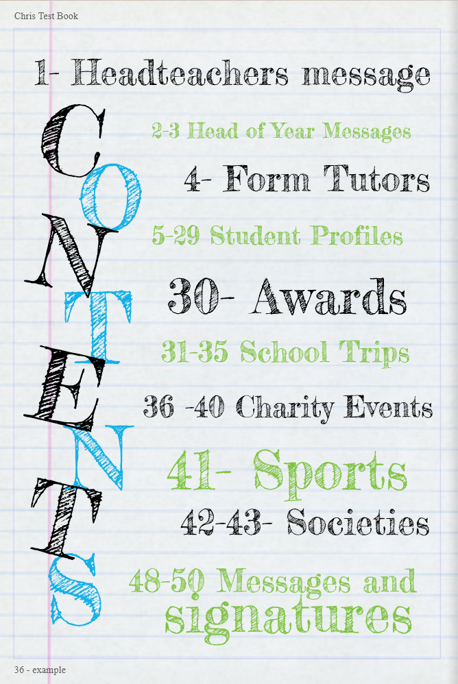
A strong design idea that people like to create year in year out. The journal look is, and always will be, in style. If you’re going for this theme, you’ll want to support it with handwritten style fonts and the perfect backgrounds.
This design is super simple as the font really does the hardwork for you. This is Fredericka the Great (an awesome name I know and you’ll find it on page 23 in the font selector) and it works so well with the journal look.
To add the title to your page you’ll be using the add title button and adding each letter as a new title text box. Make your font as big as you can go for maximum impact and you can create contrast using alternating colours for each letter. Align each letter under one another in a slightly offset way and rotate each slightly by clicking on the circular arrow icon that shows at the top of the text box.
Now you just need to add in your section titles (again using the add title button). For a truely authentic design, stick to the old-school colours of black, blue, red and green. We all had one of those four-colour pens in our pencil case right?
WANT MORE DESIGNS?
Head over to our Pinterest board for more page type ideas and tutorials. Got an awesome idea that you want to share with other project editors? Let us know and we’ll share your designs as part of our #makeitmonday


