Colour Palettes
“The purest and most thoughtful minds are those which love colour the most” -John Ruskin
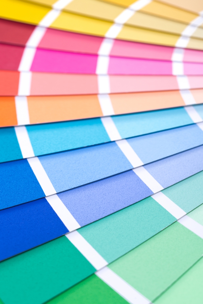
Bold and beautiful yearbooks are full of careful design choices and picking the perfect colour palettes for your pages will really help you create distinctive and unique creations. Unlike other companies, we believe that you, the designers and editors of the yearbook, know best when it comes to picking the perfect palettes for your yeargroup. We have some pre-made palettes if you’d like to use them but you always have the option of customising your palette choices too. Whether you’re using your school and house colours to theme your book or going completely wild with colourful pages and backgrounds, you’ll need to choose wisely for maximum impact.
As yearbook coordinators, we see thousands of pages made each year and we know a thing or two about making a yearbook stand out. Whilst it may be tempting to choose the most vivid of red or to pair bright neon colours, these don’t necessarily translate well in in print. You want people to enjoy reading their books so the first rule is about making your text elements legible…
#1: CONTRAST
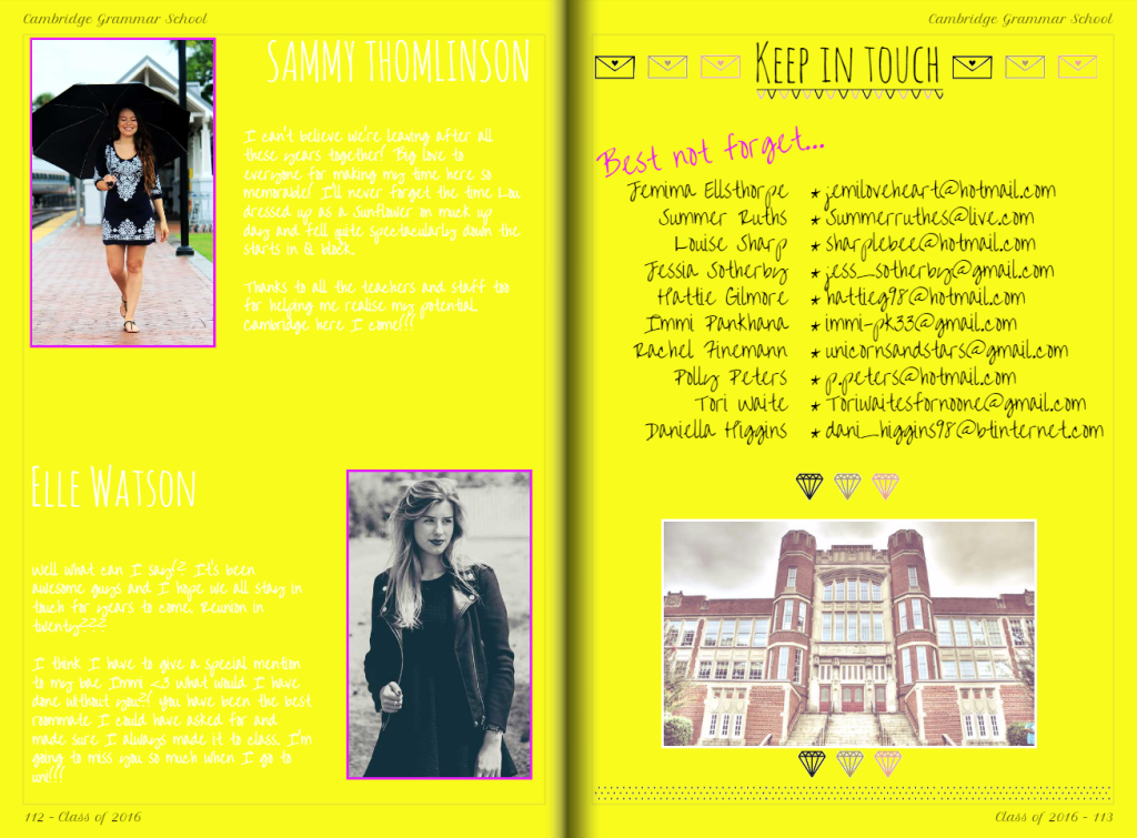
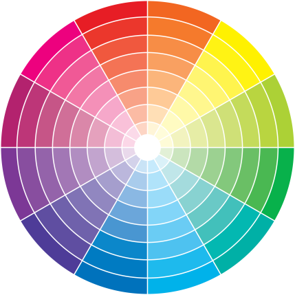
You might look at this example and think it’s obvious but you’d be surprised just how often this comes up. If you have text elements on the page, make sure they are easy to read by using a contrasting font colour. Here you can see the white text is super hard to read but the black is much clearer. If you’re unsure on what colours will contrast each other well, have a look at this colour wheel as a starting point:
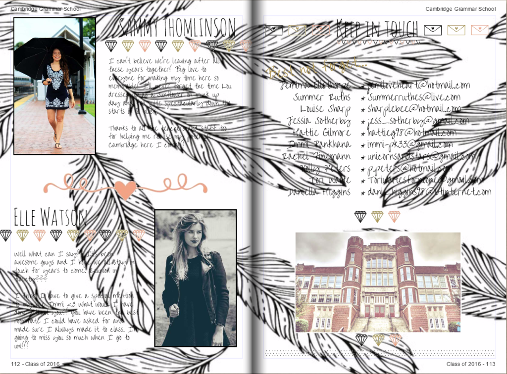
In this second example, you can see the black text over a background which uses a black and white pattern. This obscures some areas of the text so in this instance we would change the opacity settings to ensure you still get the patterned background but the text is still legible.
#2 COMPLEMENT
Whilst it’s important to have contrasting colours in your colour palette, you probably wont want this for all available colour options. As a reminder, you have 5 main colours to select plus black and white which appear in all palettes anyway. If you pick 2 or 3 main feature colours for your page, you can then build up your palette with complementary tones. These can be used to accent details on the page or as frames for your images for example.
#3 THEMING
If you’ve picked a theme for your yearbook, you might find that inspires a set colour palette for you to work with. If you’ve been inspired by social media for example, you’ll probably want to use a recognisable palette of colours to reflect this. If you’re unsure what the exact colours are, try sampling from an image using online colour picking tools to provide you with hexcodes. I often use this website as it’s really straightforward to use: http://html-color-codes.info/colors-from-image/