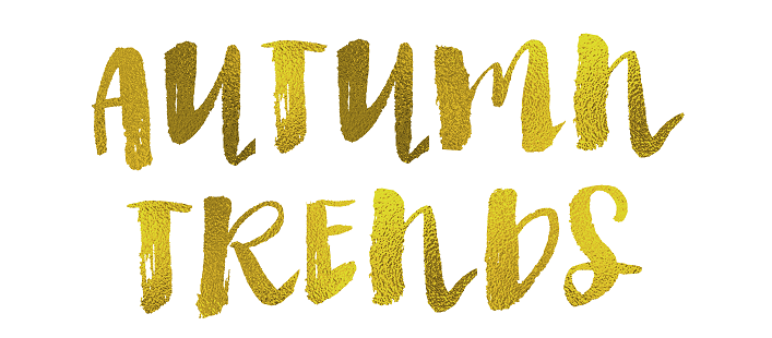
Colour Trends- Autumn 2015
Introducing splashes of colour across your yearbook pages can give your yearbook a really stylised, and often quite edgy look, so this week I’m starting my first exploration into the wonderful world of colours. Looking towards the design world as a starting, we can instantly see mossy greens and stormy blues filtering through but we’re also seeing this lovely shade of teal too which pops some vibrancy back into our palettes.

Earthy, neutral colours make great bases for page designs as you can really dress them up with layers of content. The brightest of shades can look overpowering so if you select crimson red as a backdrop for example, be sure to create high contrast using your black and white palette options for both readability and legibility reasons.
“The Fall 2015 palette is rooted in multi-faceted, androgynous colors” -Leatrice Eiseman, Pantone Color Institute.
If Pantone, world renowned professors of all things colourful, tell me it’s so then we can expect to see our clothes, homes and design work in general following suit. And Leatrice is right, this palette is clearly gender neutral so would be perfect for mixed schools where you need to keep your designs appealing to both male and female students. Here’s an example of this gorgeous autumn colour palette in action:
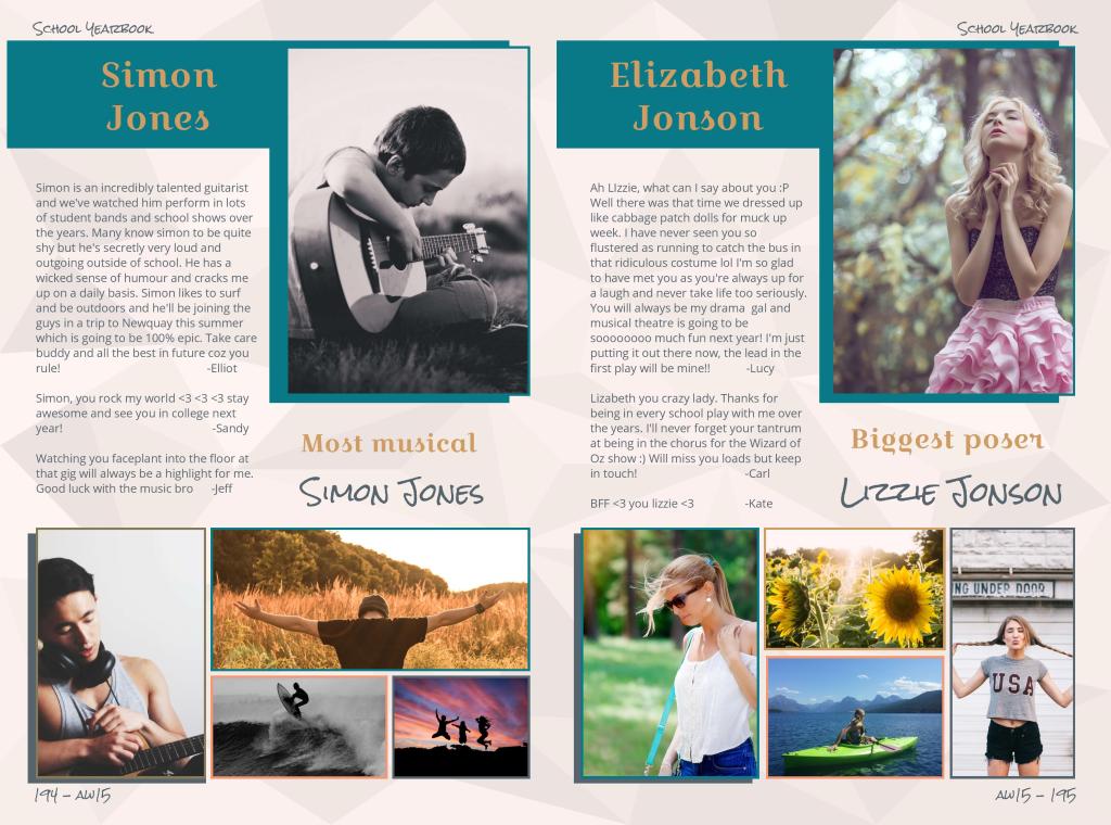
To give the background some texture, I’ve used this super subtle geometric background with 10% colour opacity set for colour #F99471. The blend creates a very soft backing to the profiles with the warmth of that dusky pink  I’ve then used my remaining palette colours to pop colour in with slender coloured frames around the profile photos- autumn palette perfection!