Photo Filters- Friend or Foe?
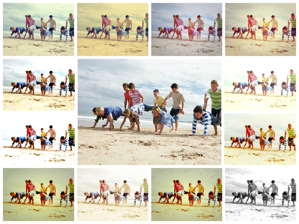
Thanks to Instagram, we’ve all got lots of photos that have had filters applied to them and whilst they look great on screen, the printed results can look a little less pleasing! Just looking at the image above shows how different these images can look and the variation between the original image in the centre and those with Lomo or other effects applied.
When choosing images for your yearbook, clarity is key. If the photo looks dark or has a darker filter applied, your print will be dark too and you may not be as visible as you thought. For best results, get great profile snaps in daylight or in a well-lit area to start with- that’ll give you a nice bright base to apply your fave insta-style effects on to. If you are unsure about how well your image will come out, it’s probably an indication that it’s a little too dark but do try printing them at home to see how clear they appear. Alternatively you can always get in touch with your yearbook editors/coordinators for advice 
P.S. Lots of you are also submitting Snapchat screenshots for your profiles which is absolutely fine but be aware that the witty message explaining your image might be too small to read when printed (depending on the size of your profile photo of course). You’ll find the dimensions for your designated photo spaces next to each frame when you select your profile. These are guide to show how big your image will be so will help you work out which of your snaps to use!